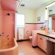
Recently, I posted a picture of a bubble gum pink bath. It was a pretty intense space, but it used the highest quality designs and products that were available in the late 30’s or 40’s.
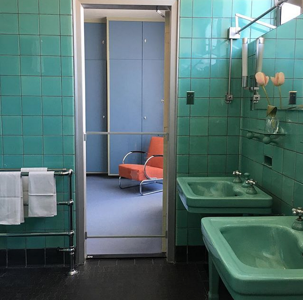
I found another vintage bath image that I thought worth sharing. Now, onward from pink world and into green…tile and fixtures all the same color. The conformity of the 41/4″ tile and the contrasting grout was certainly a trend in the 30’s and 40’s. Unlike many baths of the era, this one does not have contrasting trim. And, this apple green bath is consistent all the way through the design. The faucets have green escutcheons, the shelf brackets are green ceramic and the walls are tiled floor to ceiling! More green!
We always say that a really good design has at least one element of surprise. In this space, the orange chair provides just a bit of relief from the intensity of a solid green bath and the lavender paint is a bold choice. I must admit, this could be a good case for thinking outside of the white box.
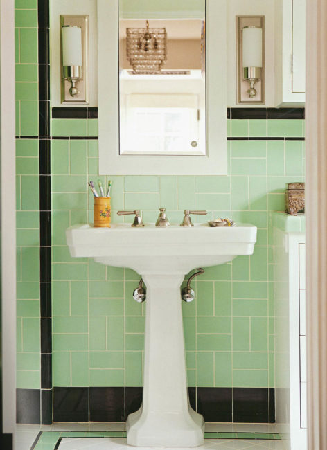
A contemporary version of this idea was created by Tim Barber and appears on page 89 of The Perfect Bath. In Tim’s version, the grout is light which tempers the mint green; the fixtures are white, another attempt to soften the palette. The black trim is in keeping with the vintage vibe of the space and the two step wall pattern in 3 x 6 changes the design direction. This is a good version of a transition of old to modern.

