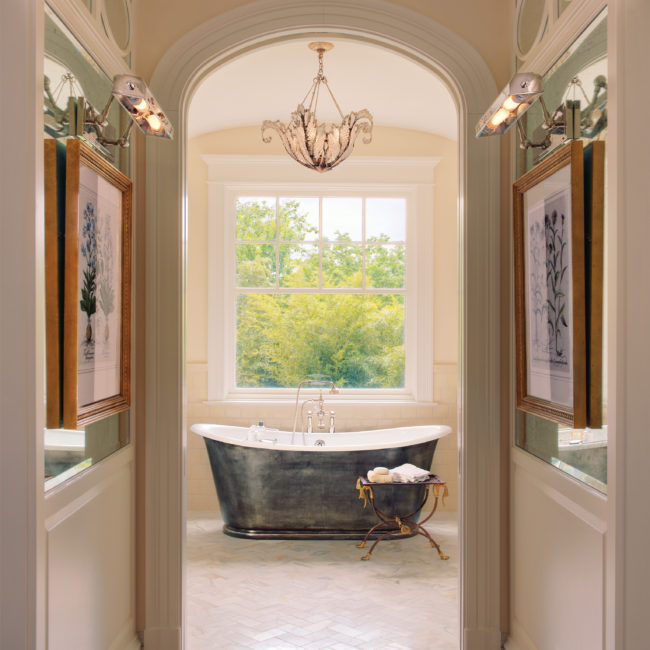
Classical architecture at its best. An axial procession through a hall lined with black and white prints leads to a perfectly placed window with a view of the landscape beyond. The sculptural and symmetrical design of the tub, with its burnished exterior and simple footed base, fills the architectural need for balance and proportion.
It goes without saying, not much more is needed in this space. Simplicity, sophistication and elegance equals relaxation, renewal and reflection. Less is more!
Bath design by Barnes Vanze Architects, Washington, DC as pictured on page 97 of The Perfect Bath.


