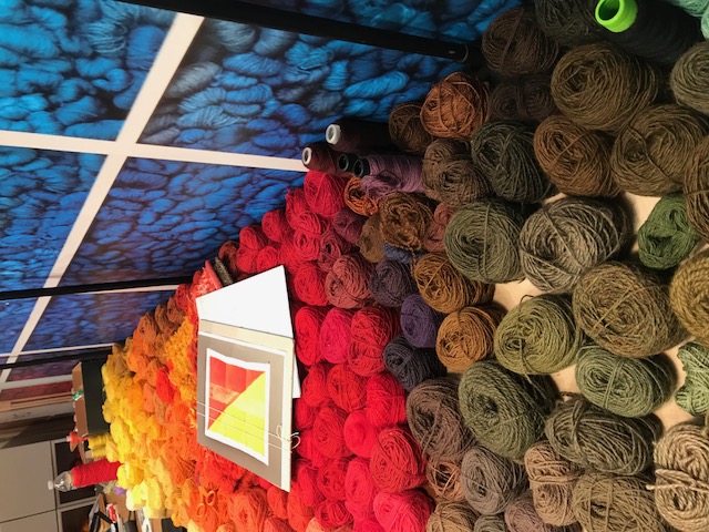
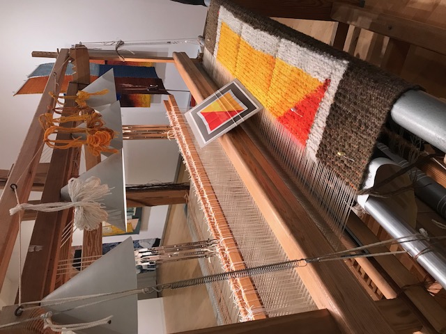
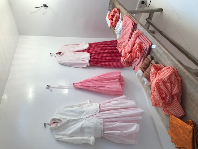
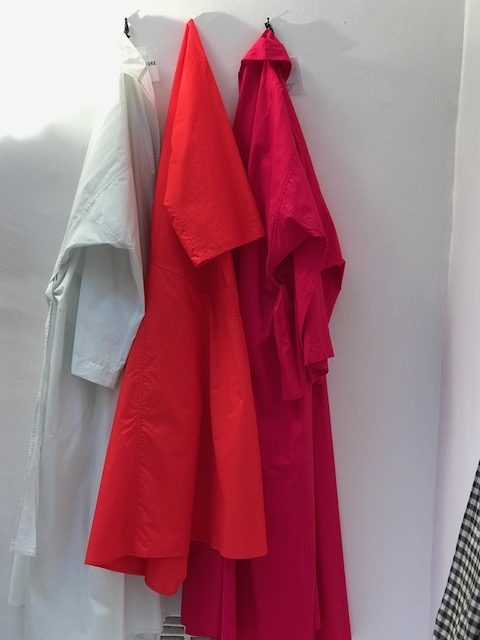
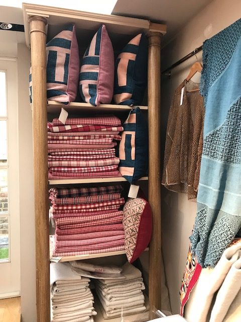
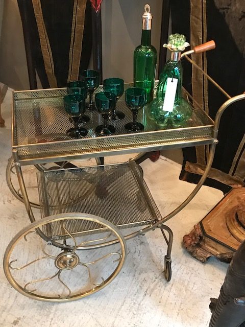
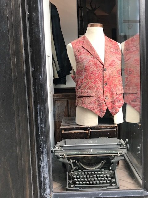
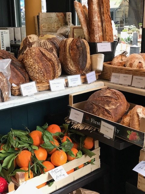
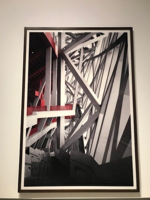
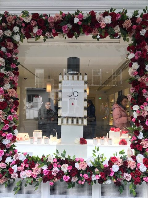
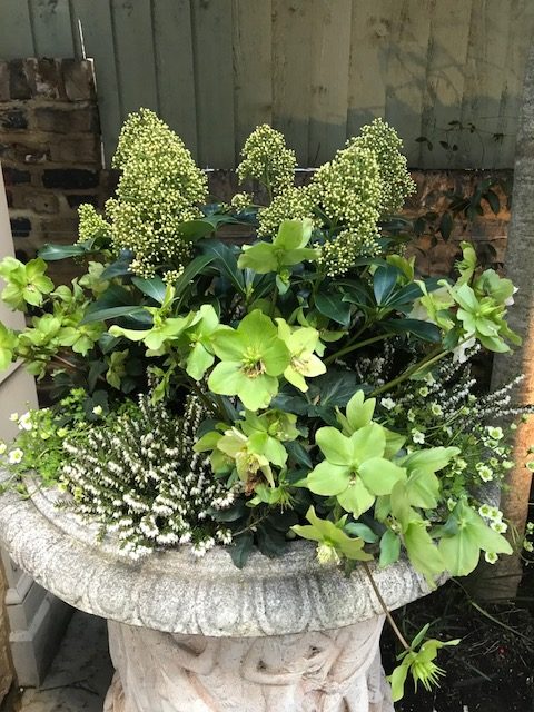
Tag Archives: Color

The color of the year, according to pantone, is emerald green. Personally, I am not a great fan of green unless it has lots of gray in it making the tones drab. I have painted the bottom of my kitchen cabinets Farrow and Ball Mouse’s Back, a mysterious gray/green, and occasionally wear an olive green sweater. That is about as far as my green vocabulary goes.

  /     /  
0

Several weeks ago I published a post on a bath that had good bones but lacked a sense of style or a reflection of its’ owners personal taste. The bath pictured in today’s post was published in THE GREAT AMERICAN HOUSE by Gil Schafer and tells quite a different story. Unlike my comments previously, this bath not only has great bones and detail, but it also reflects a very sophisticated and stylish resident. Clearly, this bath is in a traditional house or apartment where the use of bead board is an appropriate material. The tall base molding with a distinct profile and a crisp chair rail confine the lower portion of the room and define the space. It is obvious that the tall window has well articulated moldings and the door has simple yet refined hardware.

  /     /     /     /     /  
1

There is so much to like about this bath. The sink is installed on beautifully shaped metal legs with integral towel bars instead of the usual pedestal. This gives the ceramic basin a lightness that is proportionate for the narrow space. The mirrored back wall adds depth which appears to increase the size of the room. Natural light is a huge bonus and the tailored Roman shade is just the right treatment for the door; a linen fabric with a narrow stripe accentuates the verticality of the room. Brass shelves are an inspired touch, adding the idea of mixed finishes. They are practical as well, providing a place to display beautiful collections of objects and storage for elegant monogrammed towels.

  /     /     /     /     /     /     /     /     /  
0

For those of you who have been following my Friday blogs, this highly decorative bath is an unusual post. I like this very personal statement by the designer and client who were not afraid of pattern or color. The active design of the wallpaper (Zuber 1960′s) is in contrast to the simplicity of the old dark wood  herringbone floor and low wood wainscot painted an Adamesque blue.  Small personal objects adorn the beautiful marble fireplace mantle and the chair indicates a bath where visiting and conversation are encouraged.

  /     /     /     /     /     /     /     /  
0